My Master Bedroom Update


Well things are starting to come together in our Master Bedroom…
You may remember from my Home Goals post in January,
that one of the rooms I wanted to tackle this year was our room.
It’s basically been the same since we moved in here, mostly because I just didn’t have a vision for it.
But it became time to make this space ours.  To make it a place of inspiration and tranquility!


After some thought we set out some goals for this room:
1.  Create a feature wall behind our bed.  Check.
2.  Invest in new lamps.  Check.
3.  Invest in new bedding, namely a duvet.  Check.
4.  Keep it tidy and beautiful!  Check.
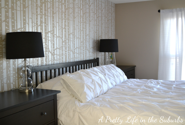
Here is what our room looks like now!
It’s still a work in progress, but I’m loving the progress so far!


So far I’ve met all 4 goals.  And now I’m finding I have a couple of new ones:
1.  Figure out an accent colour.  I need help with this one!  Any suggestions?
2.  Hang a black shabby chic chandelier.


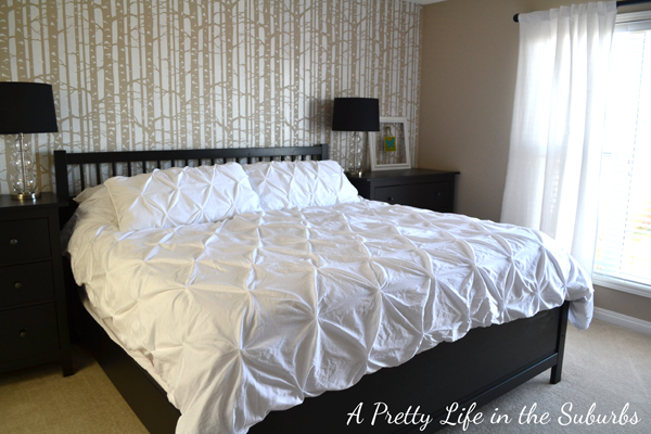
I love this feature wall! It’s not for everyone, but it works for us!
I grew up amidst birch trees, so this wall really inspires me!
It is busy, which does provide a challenge for accenting this room.
I really have to keep things simple design wise in here, which suits me fine!
If you are interested in the tutorial for this wall, and before pictures of my room,


Finding lamps was a challenge.
I didn’t want anything too elaborate, and I didn’t want any pattern or colour that would clash with the wall.  I soon found that white shades didn’t work because I couldn’t match the white to the white on the wall.  So we went with black because our furniture is black, and I was surprised at how well they work!
I was worried they would be too harsh, but they aren’t.
And I was concerned the black shade would not throw enough light, but that’s not the case!


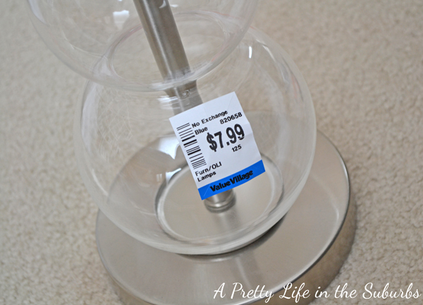
These lamps were a true find!
I was in our local goodwill scouring the aisles for some hidden gem to spray paint, then these appeared!
There were 2 lamp bases, they were dusty but looked brand new!  Not a scratch on them!
At $8 a piece I grabbed them!
Once I got them home all they needed was a good dusting and some new shades, which we found at Home Depot.
Our lamp repurpose for 2 lamps cost us less than $50.  Score!
I love them!


The bedding was a challenge too.  Possibly the hardest part of putting this room together.
Again, I had to be careful of the colour, and I didn’t want any pattern at all!
So when the hubby went to Las Vegas, I sent him on a mission to pick up this simple white duvet from Target.  I wasn’t sure if it would work, but I was willing to try it out!
Love, love, love this duvet set!


 Ooops!  Probably should have ironed the duvet.  Who has time or even wants to do that?!  Not me.
Well, so far I love it.  It’s starting to feel like a grown-up room!
It’s about time since we’ve been married for over 12 years!


Soooo, what colour do you think I should accent with?
Is your Master Bedroom done?  Or is it a work in progress?


Similar Posts

Leave a Reply

Your email address will not be published. Required fields are marked *

39 Comments

  1. I love how your room is coming along. Your accent wall looks great. I love when people take risks with their walls. It shows character. 🙂 I think a bright/lime green would be the perfect accent for your room. We’re working on our Master Bedroom as well.

  2. LOVE how your master looks!!! It is beautiful. I think you could use almost any color as an accent. I love seeing other people’s new rooms as I am planning to start renovations in my condo in the next few months. Pretty much redoing every room!!! Can’t wait to see your room when yoou add another color!!!

  3. I have just found your blog and am enjoying it so far…I love today’s post – the wallpaper is to die for..however, I’m not a fan of the duvet – I think maybe a coral accent colour might be nice with the black of the furniture and the tan colour in the wallpaper – I am looking forward to seeing the room in the next stages -Cheryl from Ontario

  4. Love the duvet. I’ve been eyeing that one myself.
    I’d go with a deep red myself for accent, but that’s just me (and that I have some wall art in that color anyway)

  5. It must be a “Master Bedroom” year, as I am thinking a makeover will be in order this Fall. New paint, carpet, bedding … Your hubby did well, the bedding is awesome ! Iron? do people still do that? not my favorite to do, however the Ikea curtains in our bedroom need to be ironed after washed 🙁 . Once again, Jo-Anna, lovely.

  6. Jo-Anna, I love how it’s coming along. That bedding is gorgeous! I can not wait until we finally get Target. Their decor stuff is soo cute and very affordable. I like the idea of a bright mossy green or a shade of light turquoise as an accent color. Something earthy, but not neutral. Know what I mean?

    I have to say, | loved your comment about feeling like you finally have a grown-up room after 12 years of marriage. I kind of still feel like that! Our room is a constant work in progress. My goal is to have it finished by the end of the summer. We’ll see.

    ~ Catie

  7. Love your accent wall – those trees are so pretty. You totally scored on those lamps – my beside lamps are very similar but not quite the bargain 🙂 I have a white bedspread (love) and dark furniture too and we went with a limey green as our accent color. Can’t wait to see what you pick!

  8. Oh Jo-Anna! Your bedroom is incredible! I kept thinking… wait, are these her pictures? They look like from a magazine… no kidding. LOVE the wall behind the bed, so unique!

    It was so great to hear from you! Thanks so much for your kind words! Hope you have a wonderful weekend. 🙂

  9. I was taking a look at the “inspiration room” with the black white and yellow..I’m thinking now that maybe you should add some black birds randomly on the birch trees…just a thought

    Cheryl from Ontario

  10. Everything came together so well:) I love that the lamp was only $7.99! What a deal that was:) The focal wall pulls everything together and is the perfect piece to your room!!!

  11. Love it! I’m thinking mustard yellow. Or maybe a bright pink. What about turquoise? Then of course, tangerine is the Pantone color of the year. So many great choices – I can’t wait to see what you pick!

  12. What a beautiful update!! I love the colours so far, and I think a bright turquoise would be the way to go – in fact, any of the jewel tones would be perfect!

    My hubby Ray and I are finally starting renos in our place, after living here for three years. Our master bedroom is first on the list – we’re reorienting the bedroom and adding walk-in closets on one end of the room, then dismantling the current closet and placing the bed against that wall. I love your wallpaper treatment – it’s an idea I’m considering, though I’ll probably go with wall stickers instead.

    Very lovely, and I’ve bookmarked your blog, so I can follow along. Thanks for the inspiration Jo-Anna!

    Cheers!
    Pamela @ pinkcowcreations.com

  13. This is my first time visiting your blog and it’s really lovely! Can’t wait to learn more about you!
    P.S. can’t believe you got the lamp for that cheap. Value village has awesome finds sometimes…if you go at the right time, dont you think?

  14. Love the furniture! The birch trees on the wall seem “restful” (I love the woods!).
    I need to update our bedroom (29 years married, but only 4 years in this house). I’ve never thought of doing a mural behind the headboard, now, you’ve got me thinking!!
    As for your accent color…maybe you could try adding something with texture or a basket to your table tops and throw pillows in raspberry or purple to your bed. Purple seems to be everywhere…and changing out pillows can be pretty inexpensive. Thanks for sharing!

    1. Thank you so much! I do find my room very restful – I love ‘natural’ elements! And I LOVE the idea of raspberry – I think it’s the best suggestion yet, and it’s really got me thinking! Love it! Thanks so much!
      Jo-Anna

    1. I have been a floral designer and decorator for over 30 years. I suggest that you go with turquoise and lime green, the colors in the picture on one of your nightstands, as your accent colors. Choose on that you like the best and use it as the main accent color and us a bit more of it. Then use the second color in a little less of the color. But be sure to disperse both colors around the room a bit. You could do so with pillows, candles, pictures, ceramics, a throw across the bed, an area rug, drapes, a floral arrangement. Lots of possibilities. These colors would really pop against the neutrals that you have in the room and would be lovely! Down the road, if and when you get tired of them, they are easy to change out.

  15. I realize this is an older post but can you give me some information about your bedroom furniture? As you have in your room, I prefer larger pieces for nightstands. Do you also have a dresser or chest in the room?

    1. Hi Elena!
      The bed frame and both pieces beside the bed (which are dressers) are from IKEA – they are part of the Hemnes collection. The only other piece of furniture we have in our room is a big shelf on the wall facing the bed. Hope that helps?

  16. A muted turquoise would make a nice accent. Or if you want to stay in the warm palette, maybe an orange/coral? Beautiful duvet!